The Vanishing 1px Border
I previously wrote an article about the 1px border issue: From line-height to 0.5px. The scaling approach works, but when using rem or percentage units, the 1px border often disappears on certain devices. The border-image approach doesn’t have this disappearing issue. This article explores why the 1px border disappears and why the latter renders correctly.
Background
I previously wrote an article about the 1px border issue: From line-height to 0.5px. The scaling approach works, but when using rem or percentage units, the 1px border often disappears on certain devices. The border-image approach doesn’t have this disappearing issue. This article explores why the 1px border disappears and why the latter renders correctly.
LayoutUnit
In LayoutUnit, two methods for converting sub-pixels (fractional pixels) to actual physical pixels are mentioned:
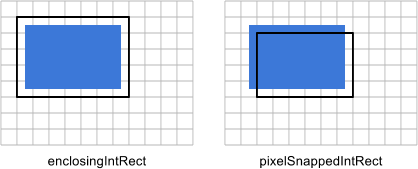
enclosingIntRect
    x: floor(x)
    y: floor(y)
    maxX: ceil(x + width)
    maxY: ceil(y + height)
    width: ceil(x + width) - floor(x)
    height: ceil(y + height) - floor(y)
    pixelSnappedIntRect
Using this method, the final physical size will exceed the original, risking box model overflow.
pixelSnappedIntRect
    x: round(x)
    y: round(y)
    maxX: round(x + width)
    maxY: round(y + height)
    width: round(x + width) - round(x)
    height: round(y + height) - round(y)
The benefit of this approach is ensuring the final rendered physical size doesn’t exceed the original, preventing overflow to the next line even when screen division produces decimals. I tested dividing the screen into seven equal parts across different resolutions with no overflow, so I suspect browsers use this approach.
Mutual Influence During Conversion
If each DOM node independently applied one of the above methods, the 1px disappearance wouldn’t occur. However, in document flow, the size of the previous node after sub-pixel conversion affects the next node’s size, thereby influencing its sub-pixel conversion.
Using iPhone 4 screen size as an example, divided into seven equal parts:
   .box {
        font-size: 10px;
        width: 14.2857%;
        height: 14.2857%;
        background: pink;
        float: left;
    }
    .box:nth-child(2n) {
        background: gray;
    }
Printing computed width vs. actual rendered width:
1 | $.each($(".box"), function(index, val) { |
The display:
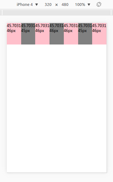
The calculation rules:
- First box: 45.7031px, rounds up to 46px, covering the next box by 1-0.7031=0.2969px
- Second box: shrinks to 45.7031-0.2969=45.4062px, rounds down to 45px, passing 0.4062px to the next box
- Third box: expands to 45.7031+0.4062=46.1093px, rounds down to 46px, passing 0.1093px to the next
- Fourth box: expands to 45.7031+0.1093=45.8124px, rounds up to 46px, covering next by 0.1876px
- Fifth box: shrinks to 45.7031-0.1876=45.5155px, rounds up to 46px, covering next by 0.4845px
- Sixth box: shrinks to 45.7031-0.4845=45.2186px, rounds down to 45px, passing 0.2186px to next
- Seventh box: expands to 45.7031+0.2186=45.9217px, rounds down to 46px
The calculated results match the display. Readers can test with different resolutions and predict correct results using these rules.
Conclusion
The 1px implemented via scale, zoom, viewport and other scaling methods is actually 0.5px in CSS pixels. This means it can be covered by the previous DOM node, potentially making it smaller than 0.5px, which then rounds down to 0px—hence the disappearance.
The border-image approach doesn’t disappear because its size is 1px in CSS pixels. The maximum coverage from the previous DOM node is at most 0.499999px (not exceeding 0.5px). Even if covered by 0.499999px, the size remains 0.511111px, which still rounds up to 1px. Therefore, the 1px border implemented with this approach always displays.
The Vanishing 1px Border